SRXP: Company expense claiming tool
Conceptual project
SRXP is a company software that allows employees to capture and claim expenses. Having used this software at my previous workplace, I noticed some of my colleagues had unpleasant experiences. Determined to find a solution, I dedicated two weeks to investigate the issue and propose a design solution.

Understanding the problem
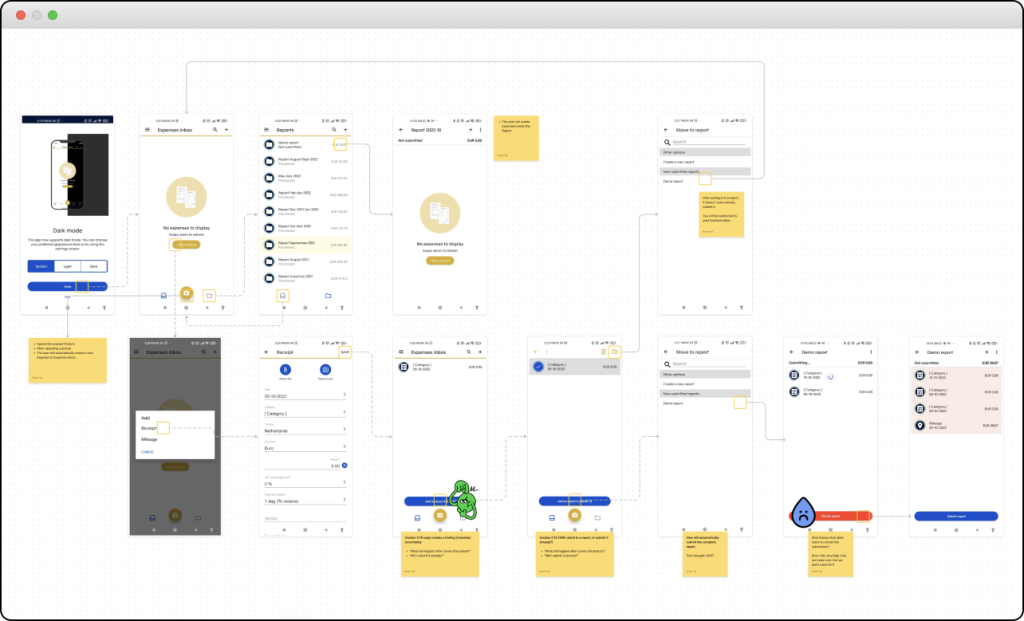
My process began with a thorough app review, using the UX honeycomb (Morville, 2004) as a framework to assess its usability systematically. I formed assumptions based on the review and later conducted user interviews with several colleagues to validate those.

Key findings
- The primary task of making an expense claim was overshadowed by other features in the app, leading to confusion.
- The app offered multiple ways to make an expense claim, resulting in a lack of clarity and a confusing user experience.
- Users often felt uncertain about which information to include in the expense claim form and whether they had completed it correctly.
“I just fill in what I think is correct and hope for the best.”
Goals
Based on the key findings, I established the following goals to improve the software:
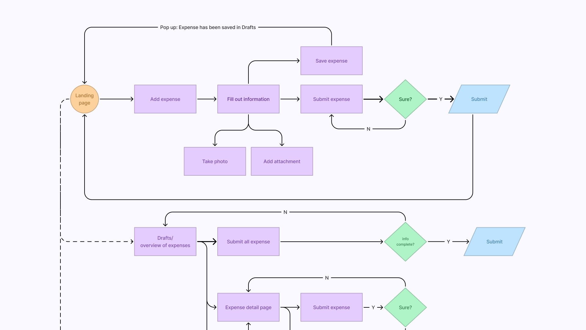
- Make the process of making an expense claim easier by streamlining the flow and prioritising the primary feature.
- Focus on a single, clear path for users to create an expense claim.
- Provide extra guidance within the form to assist users in filling it out accurately.
Designing user flows & wireframes
To address these goals, I explored new flows to simplify the process and tackle the identified issues. These concepts were then transformed into wireframes and a Figma prototype. I organised a small usability test to validate the proposed designs’ effectiveness.
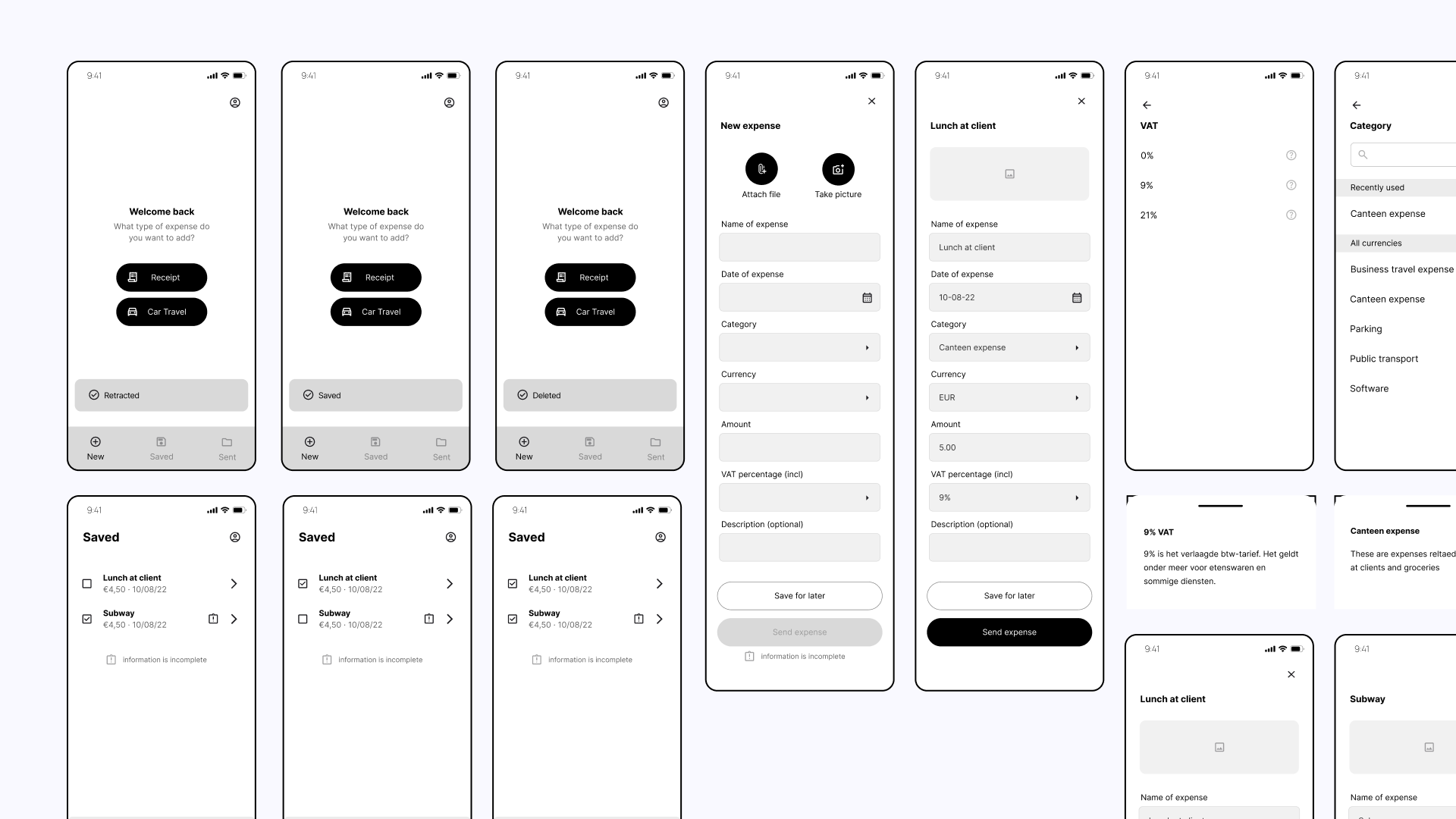
The feedback from the usability test mainly centered around using certain terminology, which we promptly addressed and incorporated into the final design.
Prioritizing important features
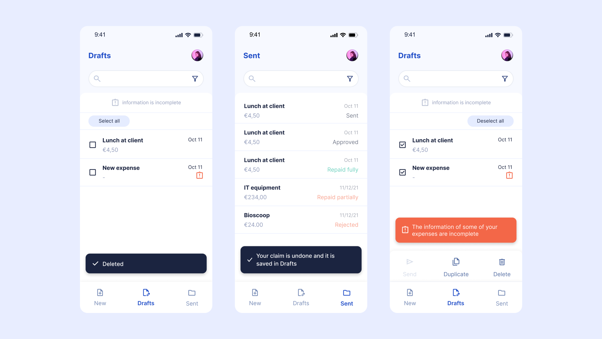
During our research, we discovered that our colleagues never used the dashboard feature on the original app. In the proposal we decided to prioritize the expense claiming feature, which is the main task that users want to accomplish with the app. The secondary task was to check whether their expenses have been processed by the company.

Providing confirmation when accomplishing a task
The original app lacked confirmation when a task had been accomplished. This led to users feeling unsure about whether they had successfully completed their task or not.
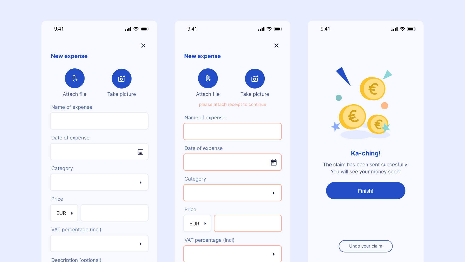
Providing extra information
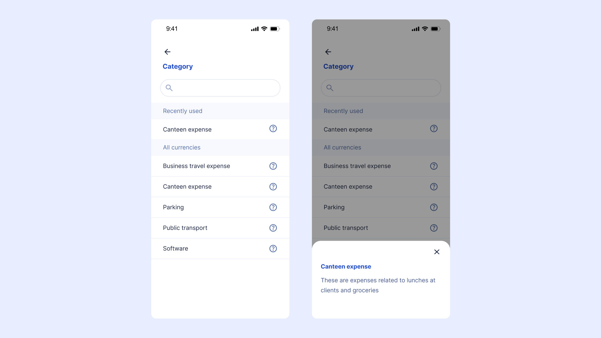
When users are claiming expenses, they may come across financial terminology that they are not familiar with. To assist them, we have added a feature that provides explanations for any difficult or vague terminology that may be used.
In conclusion, this personal project allowed me to identify pain points in the SRXP expense software and propose solutions to enhance the user experience. By prioritising the expense claim process, providing a clear path, and offering additional guidance, the software can offer employees a more user-friendly and efficient experience.